Minimal Computing #
‘We use “minimal computing” to refer to computing done under some set of significant constraints of hardware, software, education, network capacity, power, or other factors.’
This section introduces you to minimal computing principles. Minimal computing is a set of principles and practices that aim to reduce both environmental impact and barriers to access and engagement. It offers an important set of thinking tools to make responsible, frugal, and nuanced digital decisions.
Key Recommendations
Consider ways to reduce digital dependencies (software stacks), and in particular whether static websites and minimalist content management systems are appropriate for your project. When building and editing websites, use minimal web design principles and try to reduce client-side dynamic features Evaluate green web hosting options. Keep accessibility and inclusive design firmly in mind.
What can researchers do to resist techno-utopian, carbon-intensive technological traps? How can we support environmentally responsible design—even if software filled with cool unnecessary features may forever tug on our heartstrings? Minimal computing (minicomp) has at least some of the answers.
As Jentery Sayers has written:
a minimal approach reduces the need for not only substantial storage and processing power but also a reliance on middleware, databases, peripherals, and substantial pieces of hardware. Such reduction should increase access while decreasing technology’s environmental effects (e.g., by reducing waste and energy consumption).
The label ‘low tech’ or ‘frugal’ does not mean unsophisticated—it means efficient and more accessible. By sharing content without bells and whistles (such as software dependencies that the content doesn’t really need), minimalist approaches offer a better chance that content will be accessible to most users. Low-tech solutions can significantly reduce data transfer in comparison to regular, database-driven websites. As Tim Frick has said, bad UX design is not just bad for users, it trashes the planet (see Frick’s book Designing for Sustainability, 2016).
Since 2016, when the first Minimal Computing in DH workshop was held at the Digital Humanities ’16 conference, the constraints in which we conduct research have changed. There is now an urgent need to address the environmental consequences of digital technologies. This constraint has been growing for many decades, and is now a top priority out of necessity – we have procrastinated as a species and our paper was due yesterday!
Our aim here is not to give black-and-white instructions. Oftentimes there is not one right answer for computing solutions. To be clear, minimal computing does not mean easy computing. All digital work entails labour, and in some cases minimal computing might entail more labour than standard computing, as Quinn Dombrowski recently argued in an essay in Digital Humanities Quarterly. However, the labour is worthwhile, because it will ensure a longer-lasting digital project that does not require more resources than are absolutely necessary. To gain a more accurate sense of the tradeoffs our technology choices have on our environments, we can leverage the minicomp (and environmental) principles to make informed decisions with proportional costs. (For more on the issue of computing and proportional costs, see also the section of this Toolkit on Maximal Computing)
Terms that have some substantial overlaps with minimal computing include green software and digital sufficiency.
Tools and resources #
- Collectif Conception Numérique Responsable
- The Green Software Foundation
- The Green Web Foundation
- GO::DH Minicomp Working Group
- Google Scholar search for tools
- Minicomp Awesome List
- Open Sustainable Technologies
Applying minimal computing principles #
Sayers (2016) notes how a minimal approach can create complex questions and trade-offs. To work in minimal ways means “to define, often implicitly, what and for whom ‘excess’ and ‘essential’ mean in the first place.” For example, it may be important “to share the mess of development with others, and minimalist aesthetics may all too easily afford an impression that everything has been polished or refined from the start.”
Here are some ways you might apply minimal computing principles in service of environmental sustainability:
Minimal languages.
Using an efficient programming language can improve environmental impacts. If you have the liberty to make the language decision for yourself, there is some literature about the ecological impacts of these choices. How much energy, time and memory these languages require play an important role here. Humanities researchers often default to high level scripting languages, such as Python (perhaps they are easier for our humanist brains to understand). However, there are consequences for not thinking critically about our choice of programming languages.
Python, the go-to language of choice for many Digital Humanities researchers, can be observed in the following table (Pereira et al. 2017) comparing the energy and time factors of Python. Note that ‘time’ in this context means compute time, which is the time the computer takes to run the scripts, and not the time it takes to learn to write the language (although learning time is an important cost of labour factor, it is not a direct environmental factor of computational research activity):
.")
Energy Efficiency across Programming Languages (Pereira et. al. 2017).
Minimal consumption.
- Serverless instances which only consume compute time on demand. However, these require an understanding of the research and technical side to coordinate and operate.
- Shared libraries at the operating system levels, between the disk sharing and network sharing all add costs. The big providers use lots of memory, which is cheaper than hitting disk, but the consequence is you need big hardware and large scale data centres.
Minimal maintenance.
- Why are you still running it?
- On demand infrastructure: available upon user request, at specific times, and/or in specific contexts. This is a complex area subject to lots of options and discussion.
- Creating cost models
- Infrastructure is declared - a knowledge system to load the YAML file into to get your emissions costs back would be great - instead of the calculators.
- Get the ICT service catalogue to update with emissions/costs.
Other principles. Here are some of the other principles to use to plan specific aspects of minimisation.
- Minimal design
- Minimal barriers
- Minimal internet
- Minimal externals
- Minimal automation
- Minimal space
- Minimal ephemerality
- Minimal visibility
- Maximum access
- Maximum accessibility
- Maximum impact
- Maximum mobility
- Maximising resources.
For the full list of Minimal principles, see Jentery Sayers’s ‘Minimal Definitions’ (2016) at the Minimal Computing GO::DH site.
Static versus dynamic websites #
As a society we need to start treating computational resources as finite and precious, to be utilised only when necessary, and as effectively as possible. We need frugal computing: achieving the same results for less energy.
A static website has fixed content which appears the same to every user (until it is manually updated). A dynamic website is generated “on the fly” and is more associated with interactivity. Social media sites are dynamic websites, since they are woven together from a variety of user generated content.
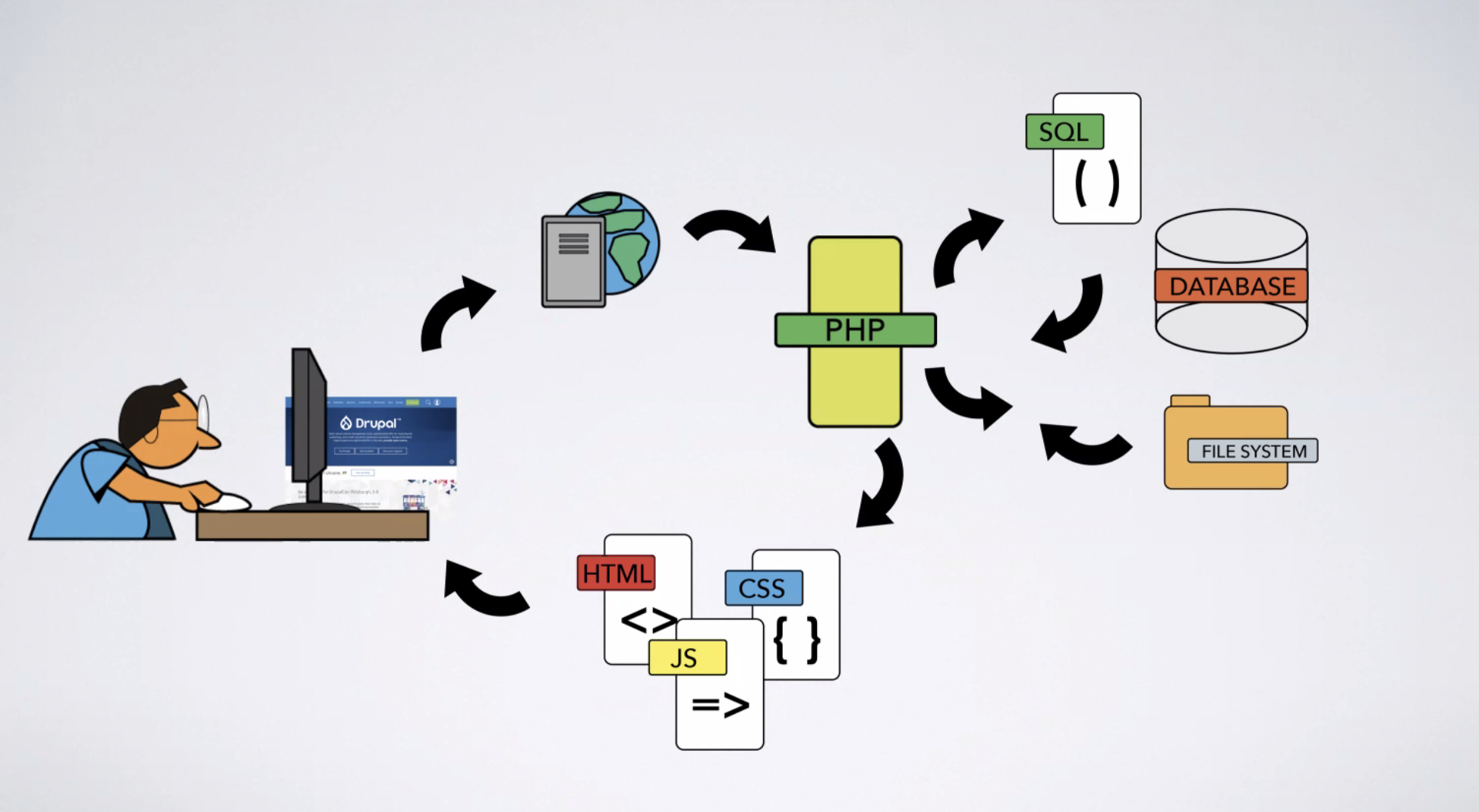
Figure: a dizzying diagram of dynamic websites (Image: Partricia Searl, University of Virginia Press.)
- A dynamic site uses server-side programming languages and technologies to pull information from a database and show it on your browser. All project data and content is stored in a content management system (CMS), which allows for bespoke, personalised, and automated changes to websites. Dynamic sites tend to be content-heavy and user-driven (that is to say the users are interacting with the content in specific ways).
- A static site consists of a directory of files that lives on the server. This means that when you are accessing web content, you are directly accessing a file on the server rather than making a request to a database or CMS for the content. Pages are therefore accessed as-is and changes need to be made file-by-file.
- A hybrid web site uses both elements of dynamic and static content.
Why might you choose one or the other (or both)?
There are good reasons to create dynamic websites, but a lot of scholarly projects will do just fine with static sites. Most of us are simply trying to communicate information on our websites: blogs, portfolios, project websites, magazines, documentation sites all can be made cheaply and hassle-free with static site generators. For example, if you are putting your CV online, you do not need a WordPress site to do that well. Static site generators, such as Hugo, even have excellent themes (e.g. Academic) for creating content such as CVs. If you have a collection of transcribed manuscripts, you can also publish that as a static site. Dynamic sites work better and are more appropriate for more complex projects that have interactive features like APIs, search engines, data visualisations, and other structured information stored in databases. That said, even a hybrid site that mixes some dynamic and static content will reduce its carbon impact. Wholegrain Digital offer a well-documented tool for estimating the carbon footprint of a website.
Although, it’s a little more complicated.
The benefit from a static site is a little more blurred nowadays, because of the way data gets cached on the web. Browsers store certain data to speed up repeat visits and may send the website an ETag to quickly check if a piece of content has changed. If not, it uses its cached copy. Service providers have similar caching techniques. This means it is not always clear which parts of your backend infrastructure are being hit directly when you use a dynamic site. A good proportion of the content might actually already be stored on your device.
See this case study from Green Coding Berlin, which asks, “How much do we save when moving our site from Wordpress to HUGO by looking at the per-request energy but also at the build time?”
Static Site Generators #
Use a static site where possible. You can do so using a static site generator such as:
- Jekyll, which has a longer history but also has more dependencies (it relies on Ruby on Rails).
- Hugo, which runs on the Go programming language, has fewer dependencies and attractive templates (this tool-kit runs on Hugo, by the way).
- Gatsby, which is good for single-page layouts, landing pages, web applications, portfolios, and institutional websites.
- And there are many more Awesome Static Web Site Generators. The “right” static site tool will depend on your own skills and needs - this is a useful introduction to thinking these through.
- See also Fast Familiar’s Climate Action Site Builder.
Content Management Systems #
However, static sites will never be suitable for everything. A content management system (CMS) is a tool that helps you create a dynamic website without coding. WordPress and Drupal are well-known examples, but there are lightweight alternatives you can use instead:
- Strapi: An open-source modern headless CMS alternative to WordPress.
- Ghost: A lightweight headless CMS designed for content creators.
- Mukurtu: A grassroots CMS project aiming to empower communities to manage, share, narrate, and exchange their digital heritage in culturally relevant and ethically-minded ways.
If you are accustomed to building websites with online CMS platforms like SquareSpace, Wix, or Wordpress, there may be a bit of a learning curve. But it is probably not as steep as it looks, and well worth investing the time. Wagtail is also worth investigating.
Tips for sustainable websites #
Minimal web design for beginners
- Use fewer videos and images. Make the ones you do use really count! Turn off autoplay for videos, and use lazy loading so that images are only loaded if needed.
- Shrink your images using a tool like Squoosh.
- Use the newer WebP image format (but keep your eye on browser compatibility).
- Try out vector graphics such as SVG files.
- Create an attractive, accessible design that favours dark colours. On some screen types they use less energy.
- Do some research and try to pick a green hosting provider. The Green Web Foundation’s directory is one useful resource.
- Use a tools such as Ecograder and Webvert (in French), to see the carbon impact of your site, and learn more about unnecessary elements (e.g. unused Javascript).
- If your site is large and/or complex, a search function may help to eliminate unnecessary browsing around.
- Avoid use of large third-party scripts, such as social media plug-ins or “all-in-one” solutions.
Images and Lazy Loading #
According to HTTP Archive, images constitute 50% of the average web page size. WebP instead of JPEG or PNG can reduce file size by 25-35% while increasing page speed performance. Switching icons and logos to SVG format can also significantly reduce page weight. If possible, consider whether you need an image in your design first and foremost. If so, ask how important the quality of the image needs to be (eg is it an important figure, or purely for background/decoration) and adjust the file format and quality accordingly.
Enabling lazy loading will optimise image and video content. Instead of loading all of the page’s resources simultaneously, the browser only loads what’s above the fold and then fetches additional images and thumbnails as the user scrolls.
Responsive images can also be really useful in making sure that only the minimal image size needed is served to a user. This approach involves generating each image in several sizes, and letting the user’s browser select the one which is most appropriate for their screen size, resolution, and DPI. This means that a user on a large Apple monitor may receive a large, clear image file, but that a user on a small phone will receive an image a fraction of the size.
As image creation usually requires multiple sizes and formats to be created, this is often an automated process. Check the documentation or support for your server setup to see if this can be enabled. For instance, WordPress has multiple plugins that can do this, alongside other optimisations (sadly, a full comparison is outside the scope of this toolkit).
Responsive image markup #
Responsive image markup involves using the srcset and sizes attributes in the tag, to give the browser multiple image sources, plus guidance about which to choose based on the current screen size.
- srcset: This attribute allows you to specify a list of image source files along with their widths. The browser will then choose the most appropriate image based on the screen resolution and the sizes attribute.
- sizes: This attribute tells the browser how wide the image will be at different breakpoints. Essentially, it’s a way to inform the browser about the size of the image as it will be displayed on the page, which helps the browser select the most appropriately sized image from the srcset, e.g.
<img src="default.jpg"
     srcset="small.jpg 500w, medium.jpg 1000w, large.jpg 1500w"
     sizes="(max-width: 600px) 100vw, 50vw"
     alt="Descriptive text">
In this example, 500w, 1000w, and 1500w indicate the width of each image file. The ‘sizes’ attribute tells the browser to use the full viewport width (100vw) for devices with a width of 600 pixels or less, and half the viewport width (50vw) for devices wider than 600 pixels.
Alternatively, an image resizing API might let you store just one image that gets adjusted as appropriate.
Overall visual style #
Reduce or eliminate videos and animation. Use fewer images and make sure you compress them. Try using fewer photographs overall. When you do use photographs, you may want to experiment with visual styles that result in smaller file sizes. For example, you could explore using shallow depth of field, and/or restricted colour palettes. Treat it as a fun challenge: use the lightweightness constraints to inspire you to create visually delicious web sites.
Minify HTML, CSS and scripts #
‘Minifying’ is a process of removing unnecessary whitespace and line breaks in HTML, CSS and javascripts with the goal of reducing the file sizes to increase page load speeds. Many text editors have plug-ins or packages to minify code (see e.g. Sublime text minify and Atom minify). If you’re using XSLT, then use the normalize-space() function. E.g.
<xsl:template match="text()">
<xsl:value-of select="normalize-space(.)"/>
</xsl:template>
Reduce client-side features (i.e. JavaScript) #
Web pages need to load, and they can be loaded just once, but when you implement user interaction features, JavaScript continuously runs in the background. For example, it’s now very common for sites to have parallax scrolling that redraws the screen when you scroll down the page, but this means that the web page must continuously consume energy on the device.
Other JavaScript features which are often requested are things like comments/forums (e.g. Discuss.io) or Web accessibility compliance tools (e.g. Recite me). These can be very useful in the right circumstances, but a minicomp assessment is rarely understood by the executive managers who make the final decisions to purchase such digital services. This maximisation of the technology supply chain through outsourcing is a shape of digital architecture which often results in you paying a company to take a copy of your user’s data so you don’t have to pay attention to managing that data yourself - and some would not consider this a fair or minimal technical solution.
Beyond potential structural unfairness introduced by the use of outsourced client-side features, there can be further, more subtle effects on the Organisation. In the specific case of ReCite Me, which is a tool to create inclusive accessible websites, its use affords the organisation to believe that the digital content they create and publish online is always inclusive and conforms to the web accessibility standards - when a more minicomp approach might be to spend the time teaching your workforce how to communicate inclusively and how to publish accessible websites to begin with.
A significant proportion of scripts are from third-party advertising or social media services, and from “all-in-one” packages for creating websites. If integrating third-party tools (such as software and plug-ins for building your website, or for sharing your site on social media), consider whether you really need them, and review the size of the files they add carefully.
Load only what you need #
Code libraries (like jQuery) and frameworks (like Bootstrap) are collections of pre-written code that developers use to save time. They provide ready-made functions and design patterns for common tasks, such as manipulating webpage elements or creating responsive layouts. Libraries and frameworks often come with extensive features, covering needs for a wide range of applications. However, a single web site might only use a small fraction of these available features. The rest of the code, though not used, still gets loaded, adding to the page’s weight. So:
- Many libraries and frameworks allow for custom builds where you only select and include the components you need.
- Opt for modular libraries that let you import only the parts you need. This can significantly reduce the amount of unused code.
- Review your website’s dependencies from time to time. Remove any libraries or parts of libraries that you no longer use.
- Try the latest plain vanilla CSS / JavaScript. Some functionalities that once required external libraries can now be achieved with plain CSS and JavaScript.
Benchmark with CO2.js and other tools #
CO2.js is a JavaScript library to help web developers and software engineers to estimate their emissions. You can run it in the browser, or in Node.js server environments, or in certain serverless and edge compute runtimes. It can be used within the development process, and/or to integrate carbon impact estimates into the user experience.
- Quickstart guide
- CO2.js GitHub repo
- Curious about driving the transition to a fossil-free internet? Here’s how CO2.js can help (February 2023)
CO2.js currently uses two models to estimate carbon emissions: the Sustainable Web Design model, and the OneByte model. The “perByte” carbon estimates from the OneByte model are lower than those from Sustainable Web Design (given the same amount of data transferred).
Of course, CO2.js needs assumptions about carbon intensity. (Is the data floating to its destination on the wind, waves, or sunbeams? Or is it being propelled there by blazing oil and coal!) Currently CO2.js draws country-scale grid intensity data from Ember, enriched with marginal intensity data from the UNFCCC.
Wholegrain Digital’s Website Carbon Calculator also offer a tool for estimating the carbon footprint of a website. Most browsers also come with built-in page inspector tools, which in some cases may let you analyse CPU useage and other useful metrics.
Consider mobile-first design #
Many users throughout the world access internet content through mobile phones on slower, less reliable connections, so a mobile-friendly design ensures better accessibility as well as a lightweight design. Loading an image or watching a video on a phone uses less energy than on a great big screen.
In general, this means taking everything in this page together, and conducting testing on at least a handful of devices (such as a phone and a tablet) to check how they respond. Simpler, less detailed designs can improve accessibility and navigation, which in turn can lead to fewer page loads and less data usage all round.
Fonts #
Your site’s font can actually have a carbon impact and affect accessibility. For example, lightweight sans serif fonts such as Trebuchet are not only good for people with disabilities but they have less ‘weight’ (fewer tails and flourishes) and therefore require fewer pixels to be displayed. Verdana is also good because it is set wider than most fonts (making it more legible without adding weight). Use one of 18 web-safe fonts to make the content compatible with all browsers and screen readers.
If using custom fonts, careful optimisation can reduce the size of a single font from 250kb+ to just 10kb. Like images, the choice of the font’s file format is important. Wholegrain’s guide to font sizes is a good introduction to this, but in general use the WOFF2 format where you can. Secondly, you can choose to use just a subset of the font’s characters to reduce the file size further. For instance, Everything Fonts has a Font Subsetter tool.
Hosting #
The Green Web Foundation has a hosting directory of hundreds of green hosting providers across dozens of countries. In the UK, Kualo is a very good option.
Another option could be to host your static site on a platform like GitHub Pages, just as we do with this website.
In general, whether a host or server is “green” or not is a complex, and rapidly-evolving topic - carbon offsets and renewable energy certificate schemes tend to make the underlying definition fairly complicated. At a higher level, you can generalise to a particular country or region based on its overall energy mix - Norway, Sweden and Europe are broadly more ‘green’ than other countries (although this needs to be balanced with data privacy between countries, if personal data is being used).
Caching #
Server setup and configuration is a large and complex topic and will depend on what software you’re running, but there are some simple steps you can take to reduce data usage. Primarily, aim to make sure that browsers are able to cache any static content provided, for a decent amount of time (such as a year). This avoids the same data having to be sent repeatedly during a single visit to the site, or on short-term return visits.
Client-side caching occurs on the user’s browser. When a user visits a website, resources like images, CSS, and JavaScript files are stored (cached) on their device. If the user returns, the browser can load these resources from the local cache instead of fetching them from the server again. Implementing caching effectively involves identifying static content that doesn’t change often, such as images and CSS files, which can be stored in the browser cache or on a content delivery network (CDN). If you’re using a CDN provider, that’s another opportunity to ask a supplier about their sustainability (and constructively scrutinise their claims).
Dynamic content and API call results can also be cached by employing strategies like cache busting, where a version number or timestamp is appended to filenames to manage updates. By reducing the amount of data transmitted over the network and decreasing server processing requirements, caching can lower its energy consumption. Generally speaking, static content can be cached for longer periods, whereas dynamic content may require shorter cache durations. Using HTTP headers like Cache-Control helps control how long content is stored in browser caches.
Server-side caching is about storing a copy of the content generated by the server, such as web pages, images, or other data, so that the server doesn’t have to regenerate it from scratch every time a user requests it. This cached content is stored in a temporary location on the server or an intermediate cache server like Varnish Cache. When a page is requested for the first time, the server processes the request, fetches data from a database if needed, generates the HTML for the page, and serves it to the user’s browser. With server-side caching, this generated page gets cached for the next user.
Blocking bots #
If you find you are popular with our automated friends, consider using a script to discourage them.
Software development #
It is worth exploring the work of the Green Software Foundation, including the Software Carbon Intensity Specification, which includes a methodology for calculating a SCI score for “any software application, from a large, distributed cloud system to a small monolithic open source library, any on-premise application, or even a serverless function” (Green Software Foundation 2021). See also the Impact Framework, which helps to calculate carbon impacts of applications through writing a relatively simple manifest file:
An Impact Framework manifest file is powerful because anyone can re-execute it and verify an organization’s impact calculation. You can even experiment by swapping out different plugins. The critical concept is that everything you need to calculate an impact is provided in the manifest file and anyone can re-run a calculation with the manifest file and the lightweight Impact Framework command line tool. (Design philosophy)
You may also want to investigate the efficiencies of different coding languages. Could this be something you develop in a relatively energy-efficient language like C, C++, or Rust? Mojo is a newer programming language that may be worth investigating too; it promises, “Write Python or scale all the way down to the metal.”
Critical design and system change #
‘Digital technology has ushered in an age of inconspicuous consumption. It is easy to understand the environmental impact of buying ‘stuff’ or flying across the Atlantic. It is harder to wrap your head around how much energy it takes to fly data across the web.’
Minimal computing can sometimes feel like fighting a losing battle. Joana Moll’s project The Hidden Life of an Amazon User seeks to make visible the huge amount of code involved in making one simple purchase from Amazon:
In order to purchase the book, the Amazon website forces the customer to go through twelve different interfaces composed of large amounts of code, which is normally invisible to the average user. This code carries out all sorts of operations, such as organizing and styling the site’s content, allowing interactivity, and recording the user’s activity. Overall, I was able to track 1,307 different requests to all sort of scripts and documents, totaling 8,724 A4 pages worth of printed code, adding up to 87.33MB of information. The amount of energy needed to load each of the twelve web interfaces, along with each one’s endless fragments of code, was approximately 30 wh. (Moll 2019)
Do we really have to burn coal so that every user can get personalised recommendations whether they want them or not? Yet these maximalist approaches are everywhere. So how do we also work toward larger structural change? We need to do two things:
- Adopt and promote behaviour change (such as minimal computing), and
- advocate for deeper structural changes to support those changes in the longer term.
Although the first point is vital, on its own it is not enough. E.g. a review of interventions at the household level concludes that: “taken in isolation, behavioural interventions have a very small positive effect on climate change mitigation behaviours while the intervention is in place. Once the intervention stops, there is no evidence that such interventions produce lasting positive changes” (Nisa et al., 2019). Rather, lasting positive changes come when there are structures that support and encourage them.
The design of technological interfaces and systems, where the human meets the machine, are among the structures that must change. So are cultural norms, the rules and norms of communities and organisations, and legal and economic structures. So we might think of the link between Minimal computing and system change as a series of opportunities:
- When a user behaviour is wasteful, there is an opportunity to transform that behaviour.
- When a user behaviour resists transformation, there is an opportunity to redesign the technical environment.
- When a technical environment resists transformation, it is an opportunity to redesign the institutional environment.
- Whenever the institutional environment resists transformation, it is an opportunity to push for deeper legal and economic changes.
In this way, the everyday use of digital systems (for research and other purposes) reveals an abundance of research questions, data gaps, design challenges, exercises you might set your students, opportunities for technological innovation or entrepreneurship, as well as ways to focus and refine advocacy and activism for deeper system change. See “Advocating Within Your Institution” for further ideas.
Case studies #
- The Endings Project: This project offers tools, principles, policies and recommendations for digital scholarship practitioners to create accessible, stable, long-lasting resources in the humanities.
- Low-tech Magazine: This magazine runs a static website on a solar panel. In 2018, they outlined how they built a low-carbon website, ‘How to Build a Low-tech Website?’ which offers some practical suggestions for digital publishing.
- The University of Virginia Press website is a static site made with Gatsby.
- Making and Knowing Project: this project published a static digital critical edition of BnF MS Fr. 640, which uses minimal computing principles. See the ‘Digital Development’ section of the site for more information.
- Furnace and Fugue: this is a digital edition of an enigmatic seventeenth-century text, Michael Maier’s alchemical emblem book Atalanta fugiens, which uses minimal principles.
- Herman Melville Electronic Library: This project is a good example of a hybrid site; it has minimised its dependencies by hosting most of its web components on a static Jekyll site served through GitHub and Netlify, but it also has a bespoke dynamic tool called TextLab rendered through Heroku app. For more information on this process, see this seminar recording.
- Fast Familiar are a group of artists creating socially and environmentally inclusive artworks and projects. They have written blog posts detailing how they have improved the carbon consumption of their website and projects: ‘We Made Our First Carbon Neutral Project’ and ‘How We Made Our Website Use 50% Less Energy.’
- Solar Protocol: A platform of small solar-powered servers across different global locations. “The network routes internet traffic according to the logic of the sun, where page requests are sent to whichever server is enjoying the most sunlight at the time.”
Further reading #
Digital Humanities Quarterly 16.2 (2022) cluster on minimal computing, edited by Roopika Risam and Alex Gil.
Pasek, Anne and Benedetta Piantella. July 2021. Solar-Powered Media.
De Decker, Kris. “How to Build a Low-tech Website.” Low Tech Magazine, 24 September 2018,
Frick, Tim. Designing for Sustainability, O’Reilly, 2016. https://www.oreilly.com/library/view/designing-for-sustainability/9781491935767/.
GO::DH Minimal Computing Working Group ‘Thought Pieces’. https://go-dh.github.io/mincomp/thoughts/.
Guldner, Achim et al. “Development and evaluation of a reference measurement model for assessing the resource and energy efficiency of software products and components — Green Software Measurement Model (GSMM).” Future Generation Computer Systems, Volume 155, 2024. https://doi.org/10.1016/j.future.2024.01.033
Holmes, Martin and Joey Takeda. ‘From Tamagotchis to Pet Rocks: On Learning to Love Simplicity through the Endings Principles’. Digital Humanities Quarterly 17.1 (2023). https://digitalhumanities.org/dhq/vol/17/1/000668/000668.html.
Jarrett, Tom. “Designing Sustainable Interaction Design Principles.” Branch Magazine, 15 October 2020, https://branch.climateaction.tech/2020/10/15/designing-branch-sustainable-interaction-design-principles/.
Nisa, Claudia F., Jocelyn J. Bélanger, Birga M. Schumpe, and Daiane G. Faller. 2019. ‘Meta-Analysis of Randomised Controlled Trials Testing Behavioural Interventions to Promote Household Action on Climate Change’. Nature Communications 10 (1): 4545. https://doi.org/10.1038/s41467-019-12457-2
Piantella, Benedetta, Alex Nathanson, Tega Brain, and Keita Ohshiro. ‘Solar-Powered Server: Designing for a More Energy Positive Internet’. 2020 CHI Conference on Human Factors in Computing Systems. New York, NY, USA: Association for Computing Machinery, 2020. https://doi.org/10.1145/3334480.3383155.
Pereira, Rui, Marco Couto, Francisco Ribeiro, Rui Rua, Jácome Cunha, João Paulo Fernandes, and João Saraiva. ‘Energy Efficiency across Programming Languages: How Do Energy, Time, and Memory Relate?’ In Proceedings of the 10th ACM SIGPLAN International Conference on Software Language Engineering, 256–67. Vancouver BC Canada: ACM, 2017. https://doi.org/10.1145/3136014.3136031.
Roscam Abbing, Roel. ‘“This Is a Solar-Powered Website, Which Means It Sometimes Goes Offline”: A Design Inquiry into Degrowth and ICT’. In LIMITS’21: Workshop on Computing within Limits, June 14–15, 2021.
Santarius, Tilman, Jan C. T. Bieser, Vivian Frick, Mattias Höjer, Maike Gossen, Lorenz M. Hilty, Eva Kern, Johanna Pohl, Friederike Rohde, and Steffen Lange. ‘Digital Sufficiency: Conceptual Considerations for Icts on a Finite Planet’. Annals of Telecommunications, 12 May 2022. https://doi.org/10.1007/s12243-022-00914-x.